Basics of CSS
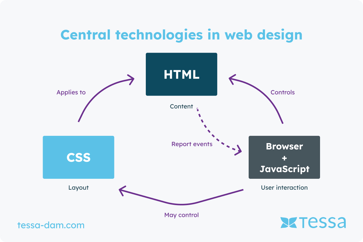
Cascading Style Sheets (CSS) are a core technology in web design, forming the backbone of modern websites alongside HTML and JavaScript. CSS is responsible for the visual appearance of a website by controlling the presentation of HTML elements. This article provides a comprehensive overview of CSS, its functionality, basic concepts, and current developments.
CSS was developed to enable the separation of structure (HTML) and presentation (CSS). This separation promotes maintainability and reusability of web designs. A CSS document consists of selectors and declarations. Selectors identify the HTML elements to be styled, while declarations contain the actual style rules.
Syntax and Selectors
A typical CSS rule set looks like this:
p {
color: blue;
font-size: 14px;
}
In this example, p is the selector that selects all <p> elements. The declarations color: blue; and font-size: 14px; set the text color and font size for these elements. CSS offers various types of selectors, including class, ID, and attribute selectors:
Class Selector: .class-name { ... }
ID Selector: #id-name { ... }
Attribute Selector: input[type="text"] { ... }
Cascading and Inheritance
The term cascading in CSS refers to how style rules are applied. When multiple rules apply to the same element, the cascade order determines which rule is ultimately applied. The order is determined by the specificity of selectors and the order of declarations in the CSS document. CSS also supports inheritance, where certain properties are passed from parent elements to child elements. This helps in applying consistent styles across an entire website.
Layout and Positioning
One of CSS's greatest strengths is its ability to create complex layouts. Early CSS versions offered basic layout mechanisms like floats and positioning (static, relative, absolute, fixed). Modern techniques like Flexbox and Grid have revolutionized layout design.
Flexbox (Flexible Box Layout) is a layout module designed for creating one-dimensional layouts. It offers a simpler and more efficient way to arrange and distribute elements in a row or column. In the example below, the elements within a container are evenly distributed and centered:
.container {
display: flex;
justify-content: space-between;
align-items: center;
}
Grid Layout is a two-dimensional layout system that enables complex grid-based layouts. It offers more control over element placement compared to older techniques. Here, a grid with three equally wide columns and a gap of 10px between the elements is defined:
.grid-container {
display: grid;
grid-template-columns: repeat(3, 1fr);
gap: 10px;
}
Responsive Design
With the rise of mobile device usage, responsive web design has become a necessity. CSS plays a central role in creating responsive websites that adapt to various screen sizes and resolutions.
Media queries allow applying different CSS rules based on device properties, such as screen width, height, resolution, and orientation. In the example below, the flex direction changes to a column if the screen width is 600px or less:
@media (max-width: 600px) {
.container {
flex-direction: column;
}
}
CSS and Digital Asset Management (DAM)
Digital Asset Management (DAM) is an essential part of modern web development and design processes. It refers to the management, organization, and delivery of digital assets such as images, videos, and documents. CSS plays a significant role in the context of DAM by helping style and present these digital assets efficiently.
Integration of DAM in web design
Integrating DAM systems into the web development workflow enables efficient management and utilization of media resources. CSS can be used to ensure the appearance of these assets is consistent and appealing. For example, images stored in a DAM system can be styled with CSS to ensure they display uniformly and correctly across different devices and screen sizes.
Dynamic styling of assets
One advantage of using DAM systems is the ability to dynamically update digital assets. CSS can help seamlessly integrate these updates into a website. For example, CSS variables can be used to define styles centrally and update them as needed without changing each style rule manually. The following example defines CSS variables for the appearance of images and videos. By centrally managing these variables in the DAM system, changes can be implemented quickly and easily:
:root {
--image-border-radius: 10px;
--video-shadow: 5px 5px 10px rgba(0,0,0,0.5);
}
.image {
border-radius: var(--image-border-radius);
}
.video {
box-shadow: var(--video-shadow);
}
Optimization of load times
DAM systems often provide features for optimizing and delivering media content. CSS can help efficiently load and display these optimized assets. Techniques like lazy loading and using WebP images can significantly improve load times.
img {
width: 100%;
height: auto;
display: block;
}
Combined with DAM-optimized images provided in various resolutions and formats, CSS ensures the best versions of the images are loaded to improve website performance.
Accessibility and Consistency
Another important aspect of using CSS in conjunction with DAM systems is promoting accessibility and consistency. CSS can ensure digital assets are accessible to all users, regardless of their abilities. For example, alt texts for images can be centrally managed in DAM systems and styled consistently with CSS classes:
.alt-text {
font-size: 14px;
color: #666;
}
By centrally managing and applying such styles, it can be ensured that all digital assets meet accessibility standards and have a uniform appearance across the website.
DAM and CSS in practice
In practice, combining DAM and CSS means that web developers and designers can work more efficiently. They have access to a central library of optimized media resources that can be styled consistently and attractively with CSS. This saves time and resources and allows focus on creative and strategic aspects of web design. The collaboration between DAM systems and CSS is a perfect example of how technology and design work hand in hand to create modern, powerful, and user-friendly web applications. By utilizing the best practices from both worlds, developers and designers can ensure their digital projects are both aesthetically pleasing and functionally effective.
Conclusion
CSS as an essential tool for web developers
CSS is an indispensable tool for web developers, controlling the styling and layout of websites. With continuous advancements and new features, CSS remains a dynamic and essential technology in the world of web design. The ability to create engaging and responsive designs makes CSS a key element for modern web applications.


